
Book Formatting Services and the Reading Experience: How City Light Publishers Creates Professional Interior Designs

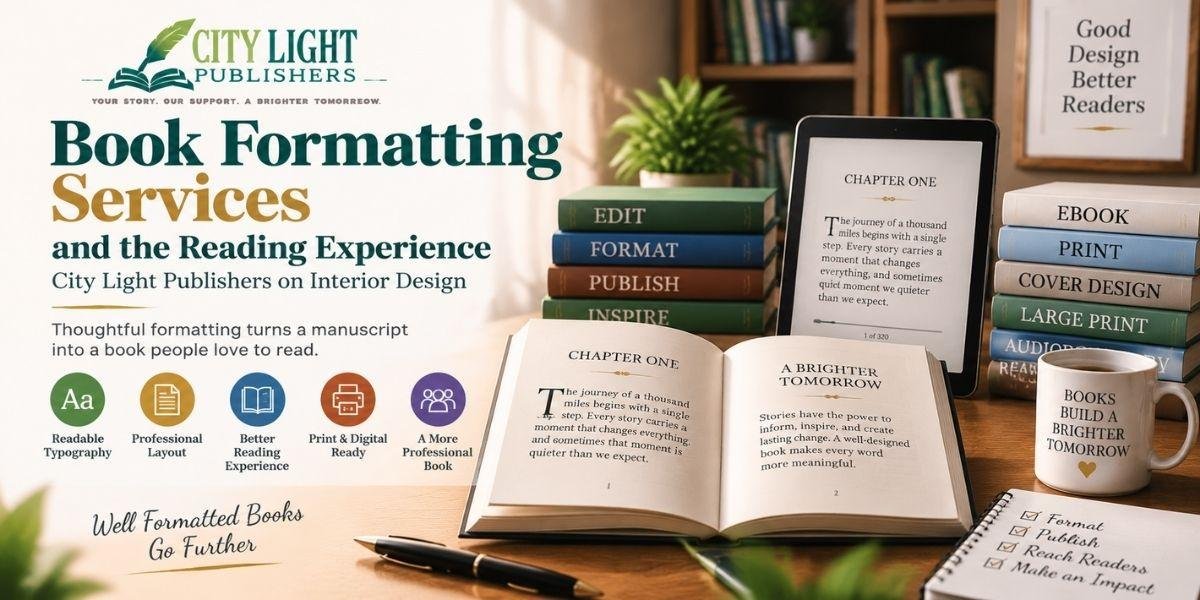
A book’s success is influenced by more than the words written on the page. Two books can contain the same content but create completely different experiences for readers. One may feel smooth and enjoyable, while another may feel difficult to follow or tiring to read.
Often, readers describe these differences as problems with the writing, but the real issue is frequently the interior design of the book. Typography, spacing, margins, chapter layouts, and page structure all influence how easily readers connect with the content.
Book formatting services play an important role in transforming a completed manuscript into a professional reading experience. While technical formatting ensures that a book meets publishing requirements, thoughtful interior design determines whether the book feels polished, comfortable, and professionally produced. City Light Publishers focuses on both aspects by preparing books that are not only ready for publication but also designed for readability.
Why Interior Design Matters in Professional Book Formatting
Many authors think formatting is simply about placing text onto pages. However, professional interior design requires careful decisions about typography, spacing, page flow, and visual consistency.
A well-designed interior allows readers to focus on the message instead of noticing the design itself. When formatting works correctly, readers can move naturally through the book without distractions.
Poor formatting often creates problems that readers experience without knowing the cause. They may feel that the book is too dense, difficult to follow, or tiring to read. These issues are often connected to design choices such as incorrect font size, poor spacing, or uncomfortable line length.
Professional book formatting services help solve these challenges by creating interiors that support the reading experience.
Typography: The Foundation of Comfortable Reading
Typography is one of the most important elements of book interior design. Small decisions about font size and spacing can significantly affect how readers experience a book.
Leading, which refers to the space between lines of text, plays a major role in readability. If lines are too close together, readers may struggle to move naturally from one line to the next. If spacing is too wide, pages can feel disconnected and unnecessarily increase the total page count.
Font size must also work together with trim size and line length. A larger page with long lines may require different spacing compared with a smaller page format.
Professional formatting requires balance. The goal is to create pages that feel comfortable to read while also maintaining an efficient and visually appealing layout.
The Importance of Line Length and Margins
Line length is another design element that strongly influences readability.
Books are not typically designed with extremely wide text areas because long lines make it harder for the reader’s eyes to return naturally to the beginning of the next line.
Margins serve more than a decorative purpose. They control the reading area and create a comfortable visual structure on each page.
Well-designed margins provide breathing space while maintaining a professional appearance. Reducing margins simply to decrease page count can make a book feel crowded and uncomfortable.
Professional book layout services consider these details carefully to create pages that feel balanced and easy to read.
Choosing the Right Typeface for a Professional Book
The choice of typeface has a major impact on the overall reading experience.
For most printed books, serif fonts remain popular because they are designed for long-form reading. They help create a traditional and comfortable appearance for novels, memoirs, and many nonfiction categories.
Display fonts can be effective for titles and special sections, but using decorative fonts throughout hundreds of pages can reduce readability.
Professional book interiors usually rely on restraint. A consistent body font combined with a carefully selected heading style creates a cleaner and more professional appearance than using multiple competing fonts.
A well-formatted book allows typography to support the content rather than distract from it.
Creating Consistent Chapter Openers and Page Flow
Chapter openings are an important part of a book’s visual identity. They signal a transition and create a sense of structure for readers.
Professional formatting considers decisions such as whether chapters begin on new pages, where chapter titles appear, how headings are styled, and whether special elements such as drop caps or small capitals are appropriate.
There is no single design style that works for every book. The important factor is consistency.
A book where every chapter opener follows the same structure feels intentional and professionally produced. Inconsistent layouts can make even strong writing appear unfinished.
Running Heads, Page Numbers, and Professional Book Details
Some of the most important formatting elements are the ones readers rarely notice when they are done correctly.
Running heads, page numbers, and front matter organization create a sense of professionalism and navigation.
Running heads can help readers return to a book after taking a break, while correctly placed page numbers provide a reliable reading structure.
Professional formatting also follows publishing conventions, such as using roman numerals for front matter and standard numbering for the main text.
These details may seem small, but they contribute significantly to how readers perceive the quality of a finished book.
How Interior Design Affects Printing Costs
Book formatting decisions also have financial consequences.
Page count directly affects printing costs, which can influence the final retail price of a book. Larger fonts, increased spacing, wider margins, and additional blank pages can significantly increase the number of pages.
However, reducing page count by making text too small or spacing too tight can create a poor reading experience.
The goal is not to create the shortest possible book. The goal is finding the right balance between readability, production costs, and market expectations.
Professional book formatting services help authors make these decisions strategically by creating interiors that look professional while remaining practical for production.
Design Considerations for Digital Books
Digital books have different formatting requirements compared with printed books.
Reflowable eBooks allow readers to adjust font size, spacing, and screen settings, meaning designers have less control over the final appearance.
However, professional eBook formatting still requires careful attention to elements such as:
- Heading structure
- Paragraph spacing
- Chapter openings
- Image placement
- Table of contents organization
A digital book without thoughtful formatting can appear like a simple text file rather than a professionally published work.
Proper digital formatting ensures that readers have a smooth experience across different devices and reading platforms.
The Right Time to Begin Interior Formatting
Formatting should always happen after the manuscript has been finalized.
Editing and proofreading should be completed before interior design begins because every content change after formatting may require rebuilding the layout.
Changes that affect page count can also require adjustments to the print cover, especially the spine width.
City Light Publishers separates editing, proofreading, and formatting into distinct stages, ensuring that formatting is completed only after the manuscript is ready for production.
Professional Formatting Creates a Better Reading Experience
The true measure of successful interior design is that readers do not notice it.
A well-formatted book feels natural. Readers can focus completely on the story, information, or message without being distracted by design problems.
A simple test is printing sample pages and reading them carefully. If readers can comfortably continue without adjusting their position, losing their place, or commenting on the layout, the design is working effectively.
City Light Publishers provides professional book formatting services designed to help authors create polished interiors for print and digital publishing.